
First impressions matter. Not just in in real life, but in the digital world as well. You’ve most likely already got an existing website. But the question now isn’t whether or not you’ve got one. The million-dollar question is, is your website responsive?
If you haven’t implemented responsive website design yet, you need to read this entire article. I promise this will only take a few minutes, but the knowledge you’ll take away may help increase your bottom line by thousands (or even millions) of dollars!
But first, how to tell if your website is responsive?
There are tools you can use to check for responsiveness. I recommend checking out http://ami.responsivedesign.is/ or https://responsivedesignchecker.com/.
Just type in your website address and boom! You’ll see how your website is supposed to look on various devices.
But still, nothing beats real world experience…
These tools are useful, yes, but in order to understand exactly what your users are going to see on their screens, you need to get first-hand experience. This way, it’s easier for you to understand what’s at stake here.
Alright, let’s get started:
Access your website on various devices, e.g. desktop computer, laptop, tablet, mobile phone, etc. Whatever you have in the office or at home.
Does your website look exactly the same across all devices?
Perhaps it looked great on your computer. But what about on your tablet and mobile phone? Did it look good as well?
Perhaps you experienced the following:
- Your website looks microscopic on your screen and it looks absolutely horrendous!
- You need to pinch and zoom to read the text, and then scroll horizontally to read from left to right.
- You need to scroll horizontally to read content on the right side of your website (like the sidebar).
Is this what happened? If yes, then your website is non-responsive.
That said, here’s an example of a non-responsive website:
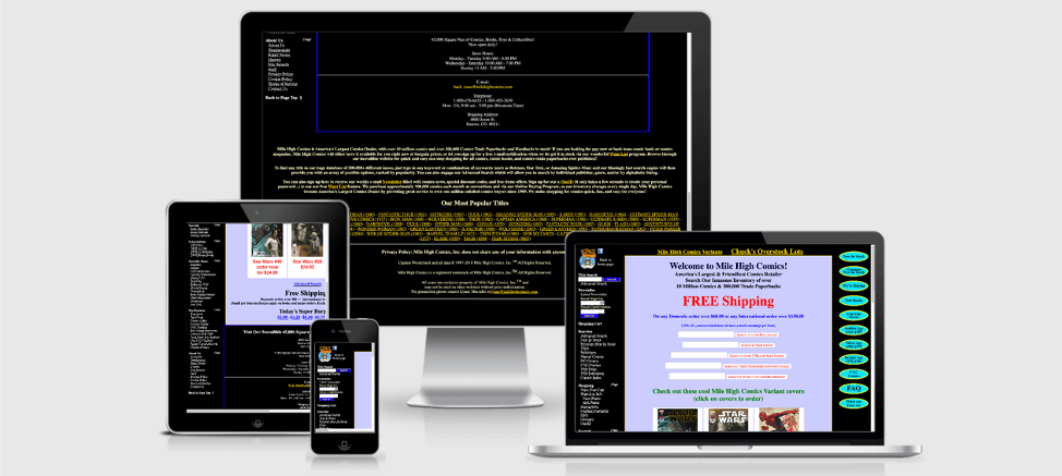 Example of a non-responsive website. Screenshot taken from http://ami.responsivedesign.is/
As you can see, the website above is definitely NOT responsive. See the ultra-small fonts on the iPad and iPhone?
Navigating the site on a small screen will probably give you a headache – and it’s NOT what you want your site visitors to experience, right?
Instead, you want to give your users a very good experience. You want to stand out from the competition. One way to do this is to make your visitors like your website. Enough to NOT leave right away.
So, here’s why you should care if your website is responsive…
- Your audience is searching for you on mobile
It’s 2020. Twenty or even fifteen years ago, nobody cared about making their sites responsive and mobile-friendly. But now that literally everyone’s got a smartphone, it’s important to keep up!
The mobile revolution started several years ago, but it wasn’t until 2016 when the number of web searches on mobile devices finally exceeded searches on desktop computers (51.3% vs 48.7%).
Two years later in 2018, mobile search numbers rose to 58% vs. desktop’s 42%. And the trend continues to move upwards as people increasingly spend more time on mobile devices than on their computers!
The point is that more and more people are using their mobile devices to search for information online. They’re not just using their phones to call and text family and friends, or post selfies on social media. Nope, they’re also using it to Google you – and your competitors.
So, if your website is not responsive, well, you’re leaving A LOT of money on the table. Instead of checking out your business, your target audience is heading over to your competitor’s responsive website.
- Better user experience
Nobody wants to pinch their screen so they can read your content. Nobody wants to scroll horizontally on their mobile phones. Nobody wants to bring their phones up to their noses just to view the images on your site!
The only acceptable scrolling for users is vertical – up or down – as they navigate your website. That’s it.
Compare the screenshot above of the non-responsive website versus a responsive website (ahem, it’s yours truly):
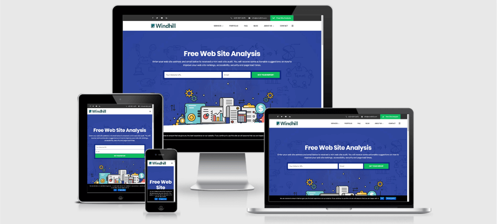 Example of a responsive website
As you can see on the screenshot, our site’s navigation menu went from being in horizontal layout at the top (iMac and MacBook) to the ‘hamburger’ menu icon (the 3 horizontal bars on the upper right corner) on the iPad and iPhone.
Try typing windhill.com on your phone’s browser and see if you get the same look as the screenshot above. Scroll down the page and check out our mobile menu as well – all our web pages are easily accessible in just a few clicks/taps!
Now, wouldn’t you agree with me when I say your site visitors will love having the same optimized browsing experience on any device they use? I’m willing to bet my last dollar they would!
- Faster page loading speeds
Ever been on a slow website – on your phone? I bet you have. There are still tons of websites that haven’t caught up with the times yet.
Can you remember what the slowness felt like? Agonizing? Annoying?
With today’s blazing-fast Internet, a website that loads in 5 or 10 seconds is considered slow. There’s a whole generation of impatient, young folks who won’t think twice about hitting the back button on their mobile phone browser.
Now, one of the main benefits of employing a responsive website is that page load times will significantly improve. And this is exactly what your business needs – a fast loading, well-designed website.
So, here’s what you need to do:
Find out how fast your site loads. Type your web address on Google’s PageSpeed Insights tool.
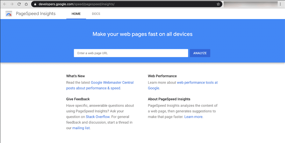 Screenshot of the PageSpeed Insights tool
Take a screenshot of your site’s current speed and save it. Once you implement responsive website design, you’ll see the speed difference – and I can guarantee your visitors will love the experience!
Check out this article on how to get a perfect score on PageSpeed Insights.
Alternatively, you can also check out https://gtmetrix.com/. This free tool will reveal the reasons behind slow loading times, and what you can do to improve it.
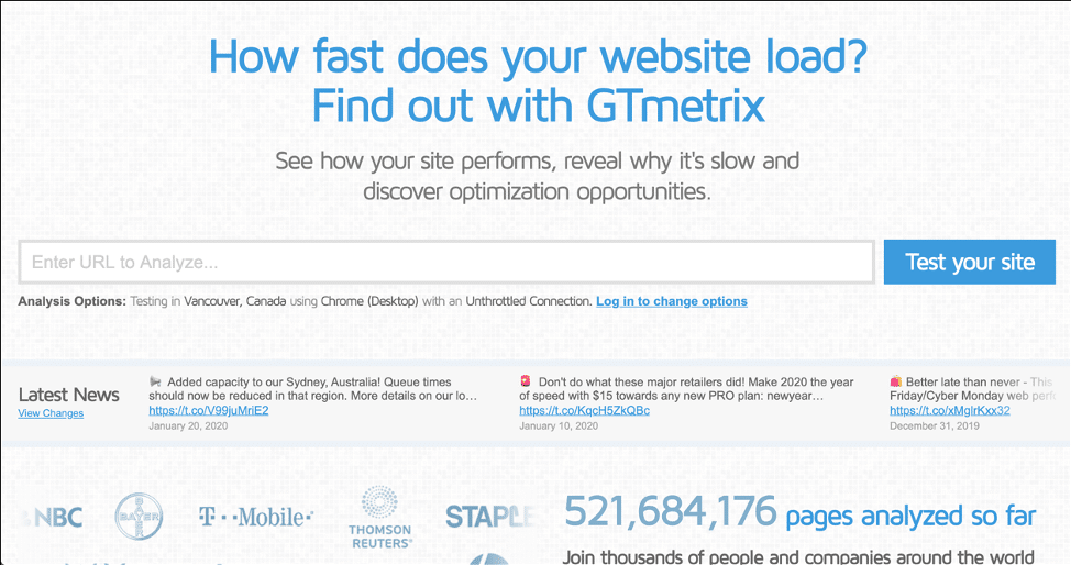 Screenshot of GTMetrix
- Lowers your bounce rates
Bounce rate is defined as the percentage of people who land on your website, and do nothing but leave right away. They don’t click on any links, they don’t click on your menu.
There’s a lot of reasons for this inactivity or lack of interest. It could be that your website is not responsive and is poorly designed, and your users can’t figure out how to get to the content they’re looking for! Or, your site takes forever to load!
Whatever the reasons may be, you need to fix the problems ASAP. Here are a couple of suggestions:
- Make your site load faster (preferably under 3 seconds).
- Make your site responsive, so it will look good on any screen size.
- Make your site easy to navigate.
Remember, you’re not unique on the Internet. You’ll literally find everything online nowadays – you NEED to capture your visitor’s attention. Make your business website stand out and your bounce rates will magically go down!
- Better conversion rates
What do you think it means when people spend more time on your website? Easy – they’re interested in what you’re offering! They’ll read your articles, they’ll read your ‘services’ and ‘about’ page. They want to get to know you better to see if they can trust you.
A responsive website will definitely help build that trust as it means you respect them and their time. You’re making it easy for them to navigate your site and locate the information they’re looking for.
That said, people buy from brands and businesses they like and trust. By implementing responsive design for your website, you’ll be paving the way for more leads and sales for your business.
Just make sure your calls to action (CTA) are clear, that is, what do you want your visitors to do on your website? Do you want them to sign up to your mailing list? Buy your product? Read your product reviews and click your affiliate links?
If your CTA is hidden (or you’ve got none at all), then your conversion rates are going to suck no matter how beautiful or responsive your website is.
- Google will most likely reward you with better rankings on search results pages
There are other search engines out there, of course, but since Google accounts for 87.96% of the global search market, we’re going to focus on their preferences here.
That said, there are a lot of factors that go into ranking up high on Google. A responsive website is just one factor, but a big one at that!
Google is all about user experience. It wants to give its users (those who use Google to search for stuff on the web) the best possible experience. They’ll reward compliant websites (fast-loading, responsive, low bounce rates, etc.) with better rankings for relevant search queries.
So, if your site is slow and non-responsive, don’t have high hopes of appearing on page one of Google search results!
- You only need to maintain one version of your website
I don’t know about you, but just a few years we were building two website versions for our clients – a desktop version and a mobile version. As you can imagine, maintaining both versions was time consuming and difficult.
But fortunately, with responsive design becoming a thing, web designers and developers alike only need to worry about building one website version – a responsive version!
Whatever changes and adjustments you make to your site will automatically appear – and fit – on all devices. Pretty amazing, right?!
Once responsive design is implemented, you only really ever need to worry about one thing – providing valuable content to your visitors.
How to make your website responsive?
There are a few ways you can transform your non-responsive website into a fully responsive one:
- If you’re using WordPress, you can use a responsive theme. Many premium themes are responsive, and the free ones you’ll find at org are mostly responsive as well.
- If you don’t want to change your non-responsive WordPress theme – and potentially lose your current design – use a plugin instead. Two of the most popular plugins that can convert your site to responsive design are WPtouch and AMP for WP.
- For non-WordPress sites, you can watch this tutorial on building responsive websites with HTML and CSS:
Need help getting your site up to speed?
If you’re not one to tinker around with website code and experiment with backend stuff (you may end up causing more harm than good!), then give us a call at 603-581-2675 or request a no-obligation responsive web design quote.
Windhill.com is a web design agency based out of Loudon, NH. We’ve been designing and developing websites for over 20 years. We certainly know the ins and outs of responsive web design. We’d love to help you create your site from scratch or redesign it for you – all at an affordable price!